


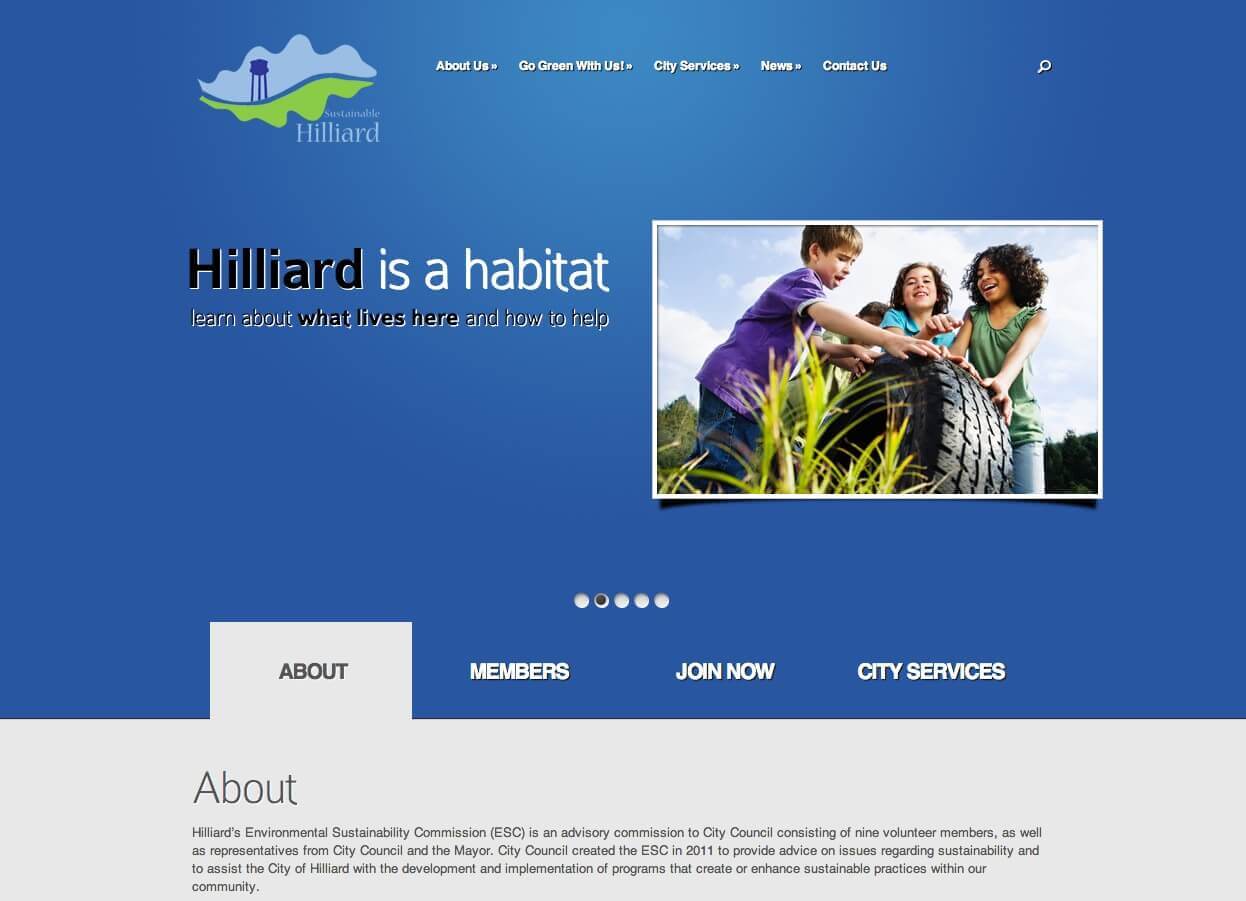
Go Green Hilliard
February 23, 2013SiteInSight featured in Columbus business blog
March 5, 2013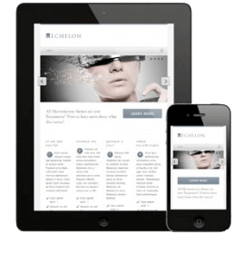 One of most common reasons for people to upgrade their websites these days is to make it possible to use the website on a smartphone or tablet.
Many older websites don’t perform very well on mobile devices for the following reasons:
- Flash video: A few years ago, it was popular to use a program called “Flash” to create interesting effects, movement, animation and more. Sometimes the menu was built in Flash so that it would do fancy things when touched with the mouse. Some sites had a homepage built entirely in Flash. The effects are amazing. The utility, unfortunately, is not good. Flash doesn’t work at all on smartphones, so your visitors may see a blank page instead of a cool effect. Even on computers, the software required to view it has to be updated often to keep it working.
- Cluttered navigation menu: Sites than have been around awhile tend to gather a complicated collection of menu links, in the same way old houses collect furniture. It’s not deliberate. It just happens. We add a page here and there and want it represented in the menu, and soon the drop-down menu has three levels of submenus, and there are eight choices across the top. This is quite difficult to work when you are squinting at a tiny phone screen and moving it around with your finger.
- Different priorities for the smartphone user: Someone visiting your website from a smartphone may have different tendencies than someone visiting from a laptop or desktop computer. For a restaurant, a computer visitor may want to browse the menu and see pictures of the food, while a smartphone user may be lost and trying to quickly find a map of the location with someone behind them honking their horn.
If any of these apply to your website, you should know the term “responsive design.” Responsive design means that your website changes how it displays, depending on what device is used to view it. One of my favorite phrases is one that apples to responsive design: “degrades elegantly.” Programmers say that the site is at its best on a computer screen, but it “degrades elegantly” as the screen size decreases. You won’t see every cool feature on your smartphone, but you can still work the menu easily and it will preserve the basic design.
At SiteInSight, we can affordably create a responsive design for you. This feature is part of our Level 2 design package. For those with a basic site, we can add a plugin that will display your site in a mostly text format when viewed on a smartphone. It’s not as elegant, but it’s not frustrating for your visitors, either.
Please contact us if you need any help creating a website that looks great and works easily on a smartphone or tablet.