Time marches on, technology improves, phones grow larger, and computers grow smaller.
As a design company who helps many businesses and organizations update their websites, we keep an eye on the latest and greatest features.
One of my favorite features we are including on a lot of new redesigns is what I jokingly call the “Sticky Menu.” One of my customers calmly informed me recently that “fixed header” is the more professional term.
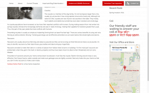
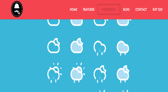
The Sticky Menu is a navigation bar across the top of your site that looks normal when you load the site. Then, as the visitor begins to scroll down the homepage (or any page, for that matter) the rest of the page scrolls, but the menu bar stays stuck at the top. This ingenious invention means that no matter how deep your visitor is into reading an article or browsing a page, the menu is always visible on the screen. This gives your visitors a sense of confidence and makes them more likely to dig deep into your website, knowing they can move on to another page without scrolling all over creation to get back up to the menu.
It’s a feature I love, and it’s just not available on most websites built even a year ago.
Of course we can’t throw away everything we have and buy all new stuff just because of a cool feature we would like to have, but if you’ve been contemplating a redesign or a refreshed look for your website, this might be the feature that pushes you over the edge.
In case you are wondering, the menu also stays fixed at the top when viewing the site from a mobile device, but the menu is configured for touching with a fat finger rather than perusing with a computer mouse.
 In the site shown here, the visitor is deep into an article about controlling or eradicating nuisance animals from around the home, but the menu and “Call to Action” buttons for requesting a quote remain in plain view at the top. See it in action by clicking the image.

