How do you balance information and design on a web site? Sometimes clients want to cut a lot of words on their site, but those words are also important for visitors and for Google searches. There’s no formula, but good design can make the information stand out.
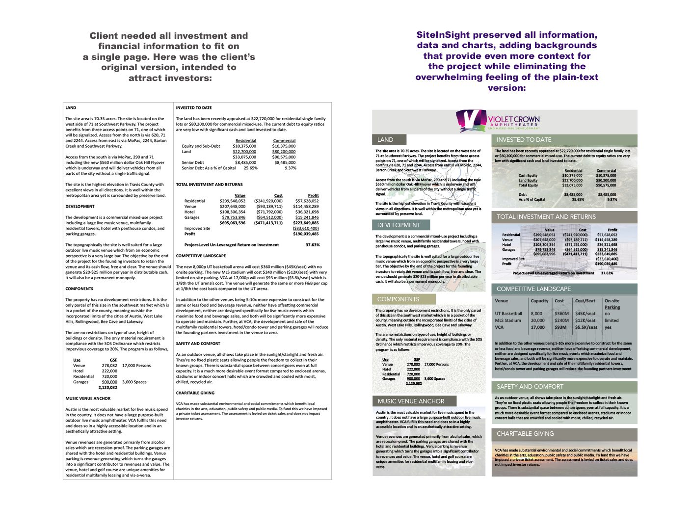
We had a client in Texas that was creating a one-page summary to take to investors for a project. They sent us a Word document packed to the gills with text and said, “We can’t remove any information from this, but it looks too crowded!” SiteInSight CEO Alice Foeller said, “Give me one day.”
SiteInSight added background and colored headings and sections. We put visual representations behind the text so people could see architectural renderings. And, as it turned out, we were able to fit even more information onto the page.

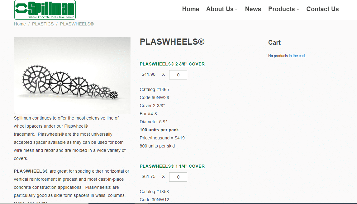
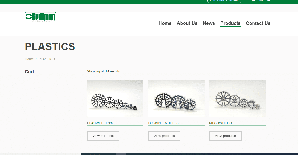
Take this page from Spillman Plastics for example. The company has many products that require a lot of description. By organizing them here and allowing more detail on a new page, the company does not sacrifice information and the site visitor can still find what they need.
Are you struggling to use your words? Or to make them work with your design? Let us look over your site and tell you how we can help you with that!


